BBB Korea Volunteer Interpretation App Redesign
1 Overview
- A project to redesign the existing UI/UX of BBB Korea’s volunteer interpretation service apps, covering both the user app and the volunteer app across iOS and Android platforms, based on a holistic Customer Experience (CX) design methodology.
- The process encompassed requirements analysis, heuristic-based diagnosis, device-specific benchmarking, wireframe optimization, and detailed screen design, resulting in redesigned guidelines and screens tailored to each platform. The final deliverables were implemented in the live service.
Role: Participated as a team member at UNIST EXPC Lab, responsible for the UI/UX design of the iOS version of the volunteer app.
2 Context
BBB Korea is an organization that provides Korean telephone interpretation services across more than 20 foreign languages, handling a minimum of 60,000 to 70,000 interpretation requests per year, primarily through volunteer interpreters. The service involves three key stakeholders: general users who request interpretation, volunteers who provide it, and BBB Korea staff who manage the operation.
BBB Korea had been exploring opportunities for digital transformation, including the use of Speech-to-Text (STT) technology to analyze interpretation content from voice data generated during calls. For this technology to connect meaningfully to the service, it was recognized that the mobile apps used daily by both users and volunteers needed to be improved first. The existing apps had numerous issues with accessibility, consistency, and usability, largely due to features being scattered across disconnected sections.
In this project, holistic Customer Experience (CX) was understood not as isolated improvements to individual screens, but as the entire journey experienced across multiple touch points by both service providers and end users. The focus was therefore placed on redesigning the app’s overall structure and interactions, rather than simply updating its visual style.
3 Approach
3-1 Requirements Analysis and Heuristic-Based Issue Identification
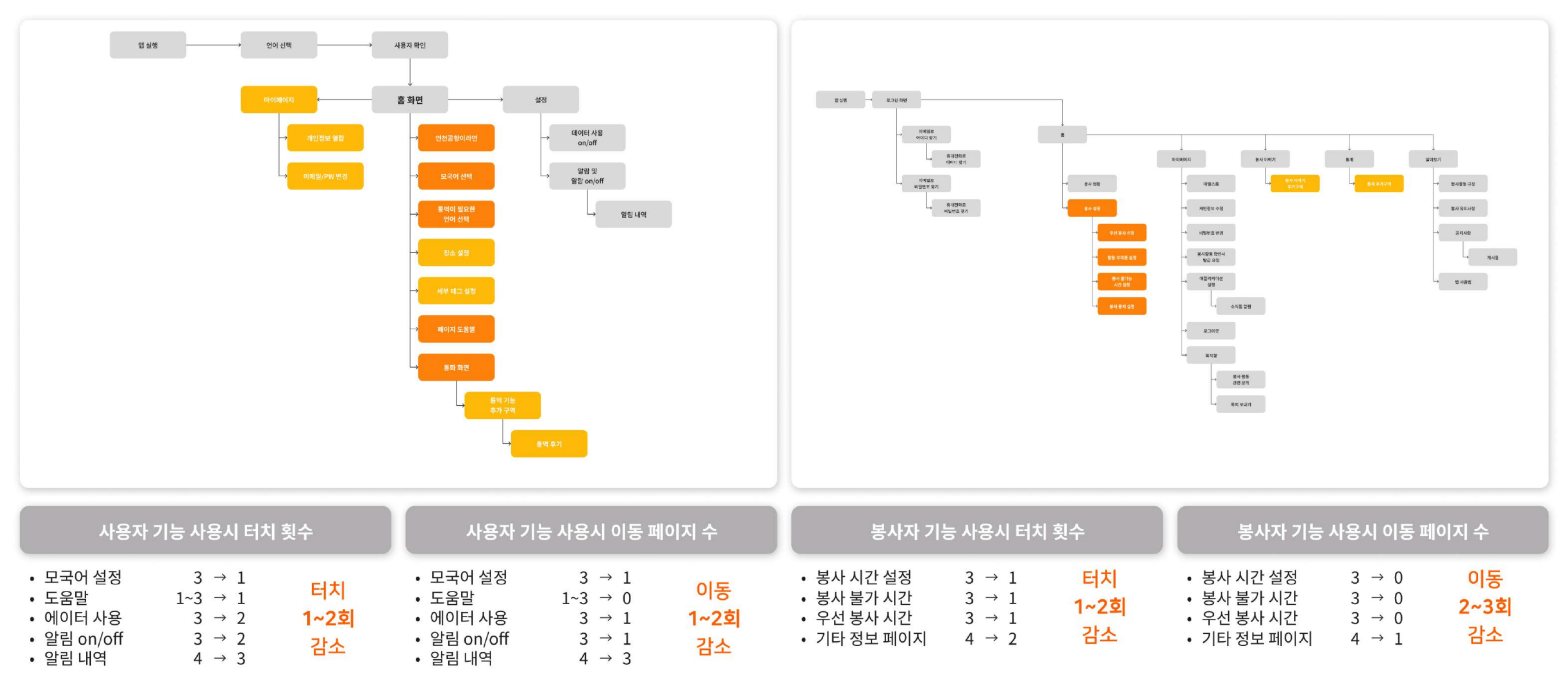
The first step was to clearly understand the current state of BBB Korea’s volunteer interpretation apps and define what needed to change. Screenshots of every screen in both the user app and the volunteer app were collected to map out the depth and flow of each app’s information architecture. This process allowed the team to systematically identify inefficient navigation paths, duplicate pages, and structural issues likely to cause user confusion.
The analysis drew on a set of established UX principles: Aesthetic-Usability Effect, Hick’s Law, Jakob’s Law, Miller’s Law, Pareto Principle, Peak-End Rule, and Nielsen’s 10 Usability Heuristics. These frameworks guided the investigation into how elements such as information volume, familiar interaction patterns, system feedback, error prevention, efficiency, and help accessibility were being experienced in actual interpretation scenarios.
Three common issues emerged from the analysis:
- Excessive depth meant that too many steps were required to reach core features. In the volunteer app, adjusting availability settings required up to three or four page transitions. In the user app, language settings were spread across multiple locations, creating potential for confusion before a user could even request interpretation.
- Inconsistent icons and labels made it difficult to intuitively understand what features did.
- A lack of feedback elements made it hard for users to confirm the results of their actions.
At the page level, more specific improvement tasks were identified: supplementary login features, password visibility toggle, placeholder text, unified naming for identical features across platforms, required field indicators, switching to drop-down interactions, correcting statistical terminology, and contact search functionality.
These findings were organized primarily as non-functional requirements and used as design criteria for subsequent stages.
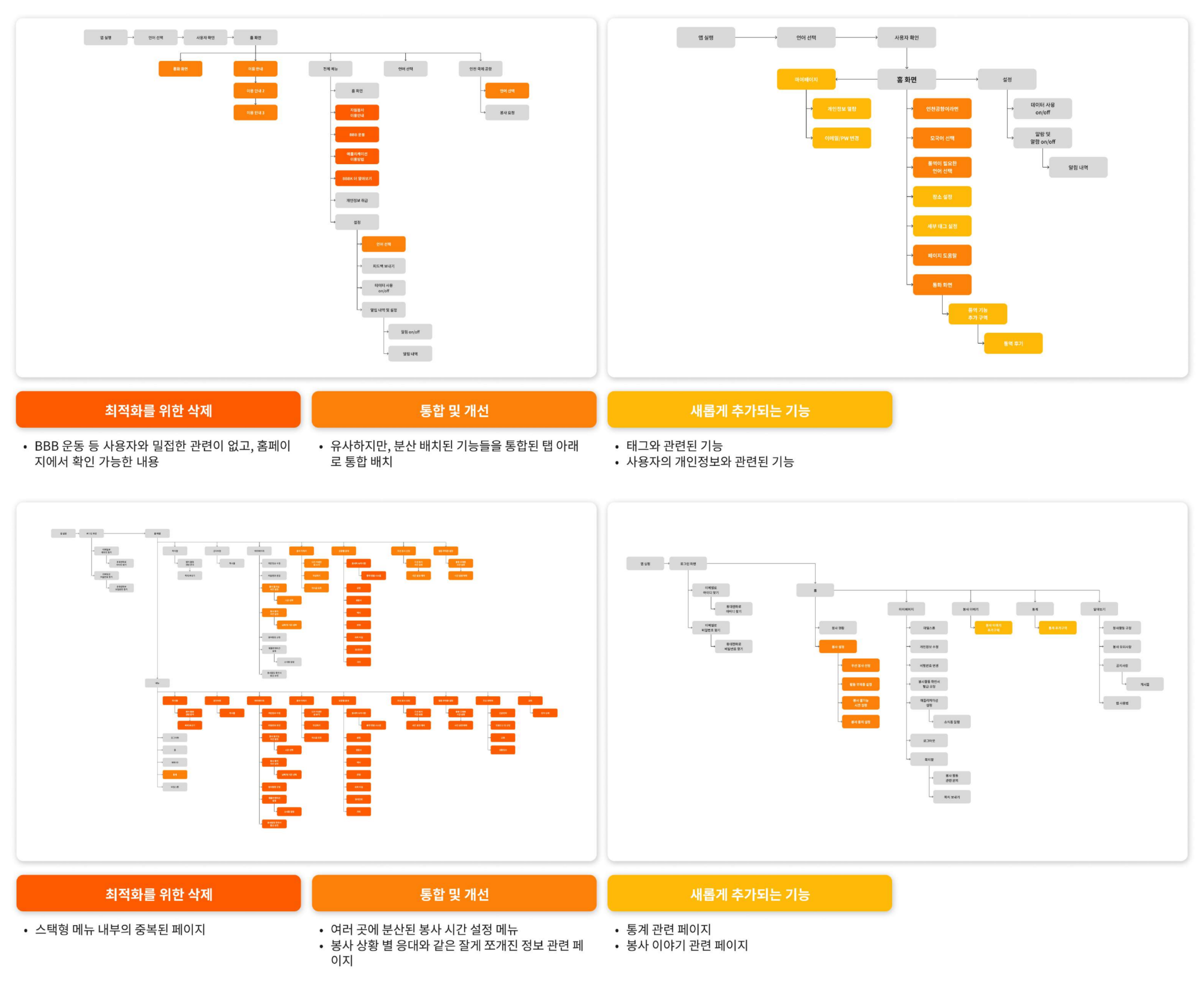 Wireframe flow comparison of the existing user app (top) and volunteer app (bottom), showing excessive depth and duplicate structures.
3-2 Benchmarking and App Structure Redefinition
To identify solutions for the issues surfaced in the requirements analysis, UI/UX benchmarking was conducted across services with comparable contexts. Given the nature of BBB Korea’s interpretation service, the analysis focused on finance apps where quick access is essential (Toss, KakaoBank), feature-heavy apps designed for broad age groups (Naver, Kakao), and hashtag-based community apps (Reddit). GUI element sizing and placement, interaction patterns, menu structures, and information display approaches were compared to identify structural patterns applicable to BBB Korea’s service.
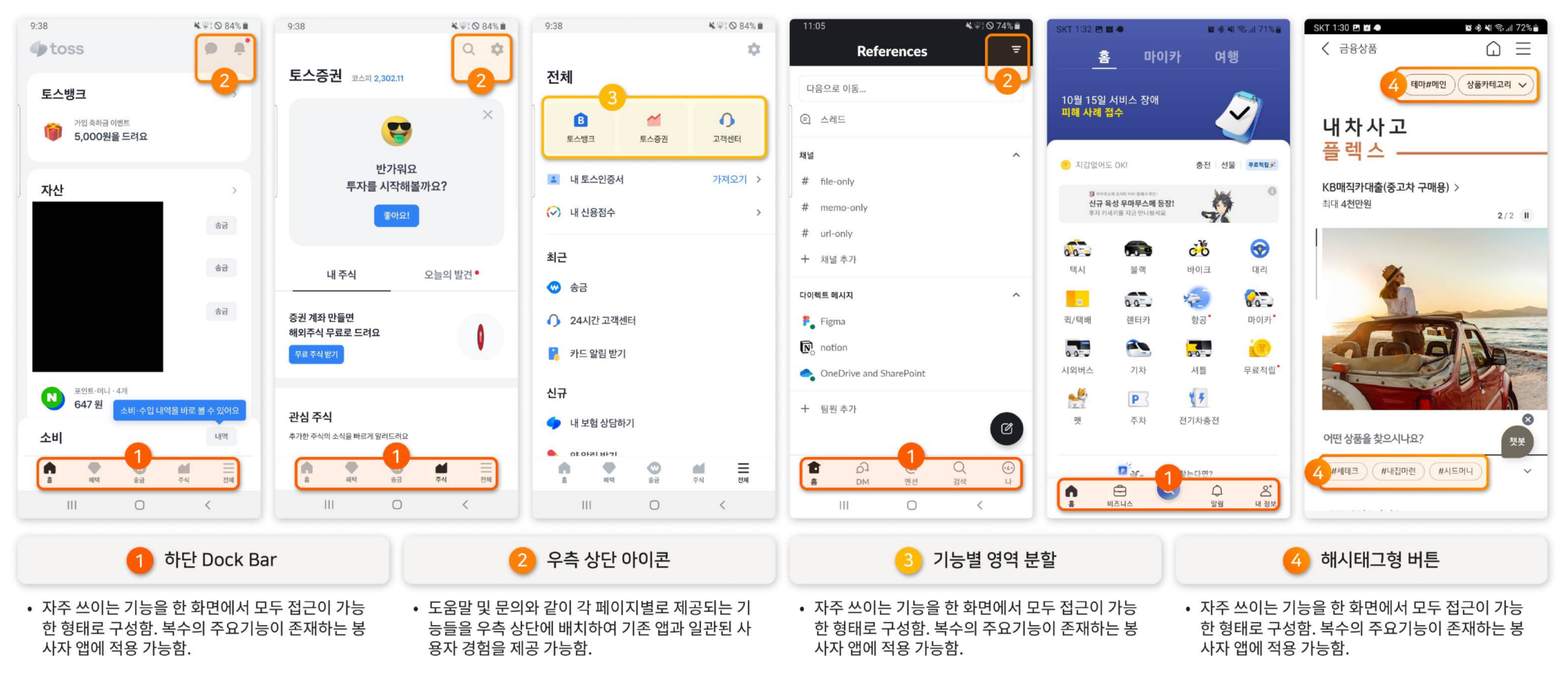 Benchmarking process for financial and general-audience apps, focusing on menu structures designed for fast feature access.
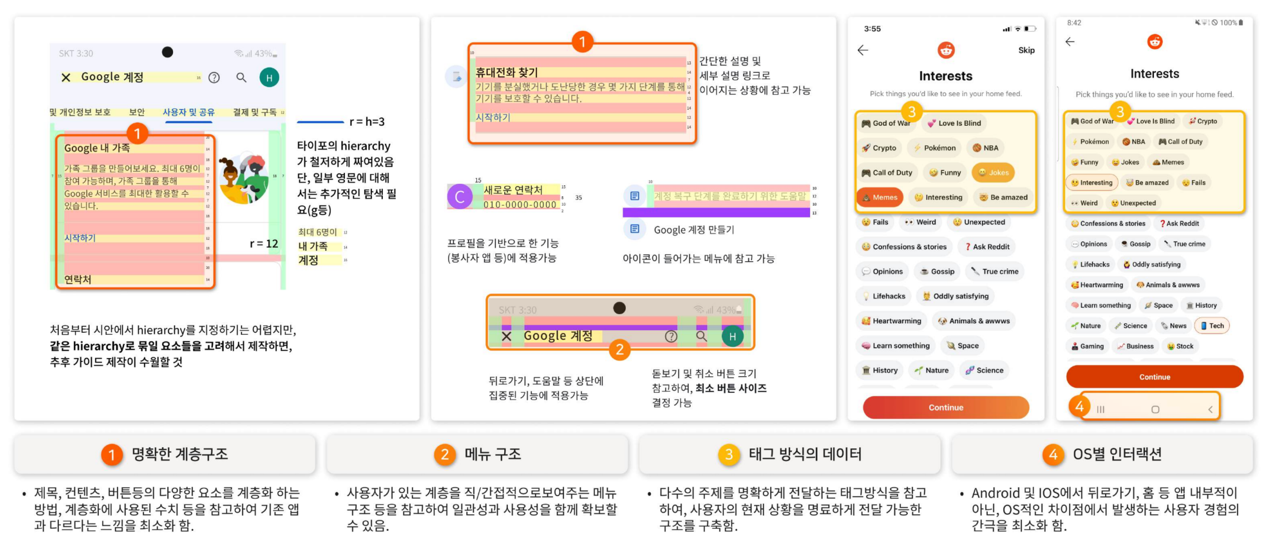 Benchmarking process for Google and Reddit, examining content and whitespace layout, and tag-based content delivery.
Two key insights emerged from the benchmarking:
- Introducing a Dock Bar. The existing hamburger menu offered an overview of all features at once, but multiple examples showed this actually made it harder for users to reach core functions quickly. Leading apps like Toss used a bottom Dock Bar to provide immediate access to key features, with a prominent central button for the primary action. This structure was judged particularly appropriate for BBBK, where initiating an interpretation request quickly is the most critical task.
- FAB (Floating Action Bar) and feature area segmentation. For cases like the volunteer app, where time-sensitive status changes (such as toggling availability) need to happen quickly, a structure that consolidates related functions in one place, rather than scattering them across menus, was identified as necessary.
iOS and Android platform design differences were also systematically analyzed, including tab bar placement, back navigation behavior, and typography capitalization conventions, to serve as reference points for the OS-specific design work that followed.
3-3 Design Guideline Development
Nielsen’s 10 Usability Heuristics and several cognitive psychology-based UX principles formed the theoretical foundation for both evaluation and design. Hick’s Law (the relationship between the number of choices and decision time), Miller’s Law (the appropriate amount of information per screen), the Peak-End Rule (designing for strong impressions at key touch points), and the Pareto Principle (concentrating resources on the most frequently used features) were each applied as concrete decision-making criteria. These principles were combined with benchmarking findings to produce a Figma-based design guideline, which was then structured in Zeplin for easy sharing with the development team.
3-4 Wireframe Redesign and Feature Restructuring
Drawing on the analysis and benchmarking, the wireframes for both the user app and the volunteer app were redesigned from the ground up. Two core principles guided this work:
- All frequently used features should be accessible from the home screen with the minimum number of taps.
- Related features that had been scattered across the app should be logically consolidated to reduce the number of pages and navigation steps.
User App
Features with low relevance to the user’s primary tasks were removed, and scattered functions were reorganized under unified tabs. Clear UX writing in the form of “source language / target language” was introduced to reduce confusion. As a result, the number of taps required to set the native language and access help was reduced from a maximum of three to one.
Volunteer App
Volunteer status-related functions, including availability settings and break mode, had been spread across three separate locations. These were consolidated onto the home screen, with state changes and time adjustments redesigned to be completed more quickly. For core features, the average number of taps required decreased by one to two compared to the original.
 User app (left): the language selection and interpretation request flow was restructured around the home screen. Volunteer app (right): scattered availability settings were consolidated into a tab-based structure on the home screen.
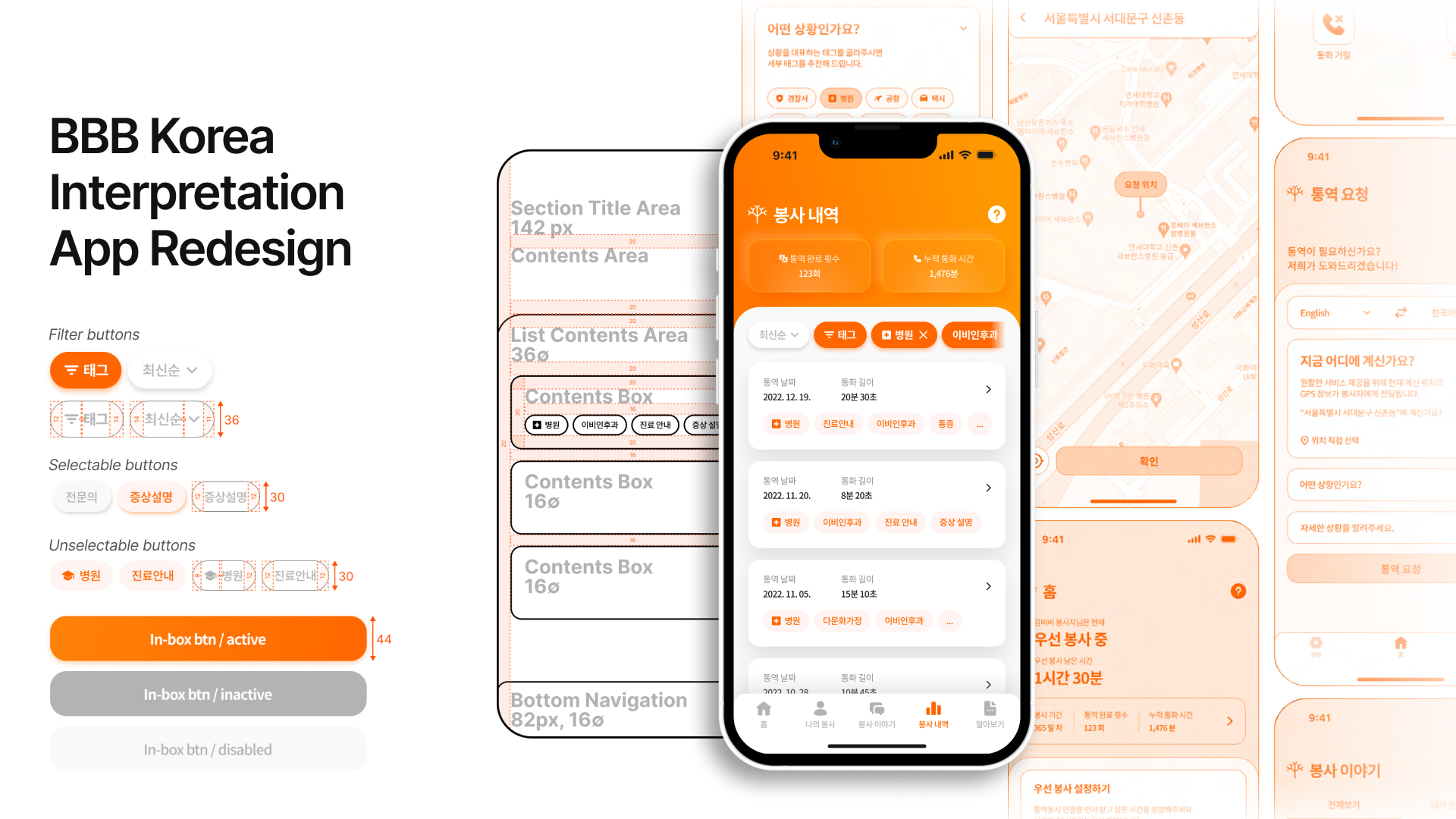
4 Outcome
The visual designs were developed so that both apps feel like a single, unified experience.
High-fidelity visual design mockups were produced in Figma based on the redesigned wireframes. Four criteria shaped the design direction:
- Respecting each platform’s design conventions (iOS and Android) while maintaining a consistent brand identity across both
- Visual consistency between the user app and the volunteer app
- Incorporating current design trends such as Neumorphism
- A holistic UI/UX that integrates new service elements (such as STT-based tagging) naturally into the experience
Detailed screens including special interactions such as scrolls and dropdowns were completed in Figma, and design specifications (font sizes, spacing, color codes, etc.) were prepared in Zeplin for seamless handoff to the development team. The final deliverables, covering both iOS and Android platforms and both the user and volunteer apps, were implemented in the live service.
User App
The splash screen was redesigned to feature photographs of people of diverse genders and ethnicities, bringing BBB Korea’s slogan, “A world of free communication without barriers of language and culture,” and brand identity to the very first screen users see.
The interpretation request experience was also redesigned for faster, more intuitive control. Source and target languages can now be set directly within the request screen, and location selection was expanded into a map-based UI with search functionality. To accommodate a growing number of supported languages, the design allows both scroll-based browsing and search-based selection.
A tag-based system was newly introduced to help users communicate context. Contextual tags and detailed tags are separated so users can describe their situation quickly with minimal selections. The existing “Incheon Airport” feature, previously limited to a specific location, was generalized and reframed as a “Quick Interpretation” function, making it applicable to a wider range of urgent situations.
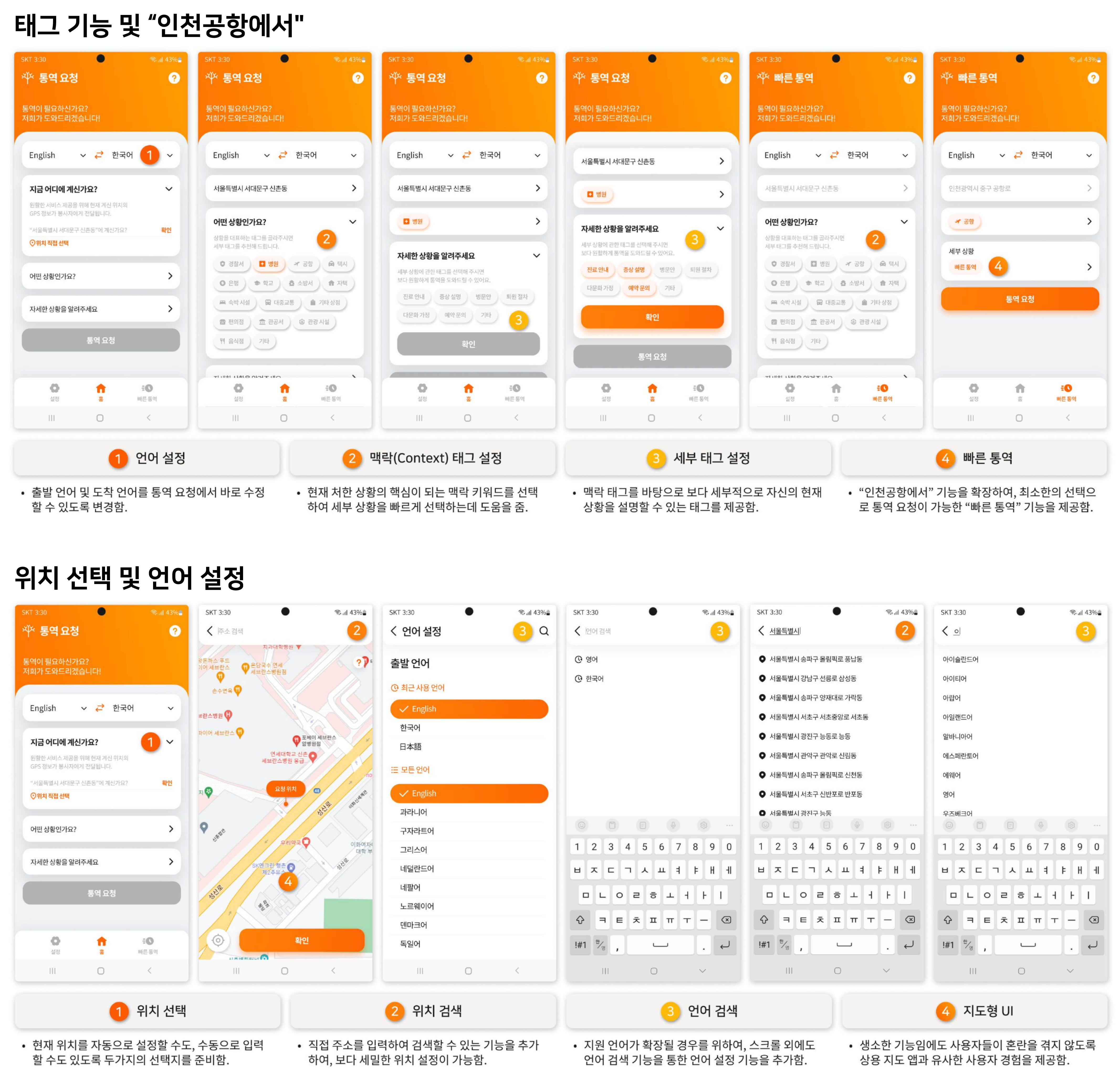 Key screens of the user app, including language settings, location selection, contextual tags, detailed tags, and the Quick Interpretation feature.
Volunteer App
The volunteer app’s core purpose is to let volunteers quickly switch between statuses, such as on standby, actively interpreting, or temporarily unavailable, and log call details. The app was restructured around the home screen to make managing availability status and time settings faster and more direct. The most frequently used states, “Priority Volunteering” and “Temporarily Unavailable,” were simplified to one-tap controls, while finer-grained settings such as “Unavailable” and “Paused” were organized into a separate settings screen. On/Off toggles were applied to specific features to reduce depth, and tab-based navigation replaced the previous menu structure. The current volunteering status is also immediately visible through color-coded visual feedback.
The call screen layout was changed from a 1x5 grid to a 2x3 grid, enlarging icons and reducing the risk of accidental taps. The limitation of communicating through voice alone was addressed by adding image sharing and in-call text chat.
The post-call experience was also redesigned to continue within the app. The review flow, which had previously relied on text messages and external links, was brought in-app and restructured around tags, reducing the effort required to document an experience. The “Volunteer Stories” section was further developed into a post-based sharing format, with likes and comments added to encourage volunteers to exchange experiences and build a sense of community. The intent was to make the volunteering experience feel continuous, extending naturally from interpretation into reflection and connection, rather than ending abruptly after a call.
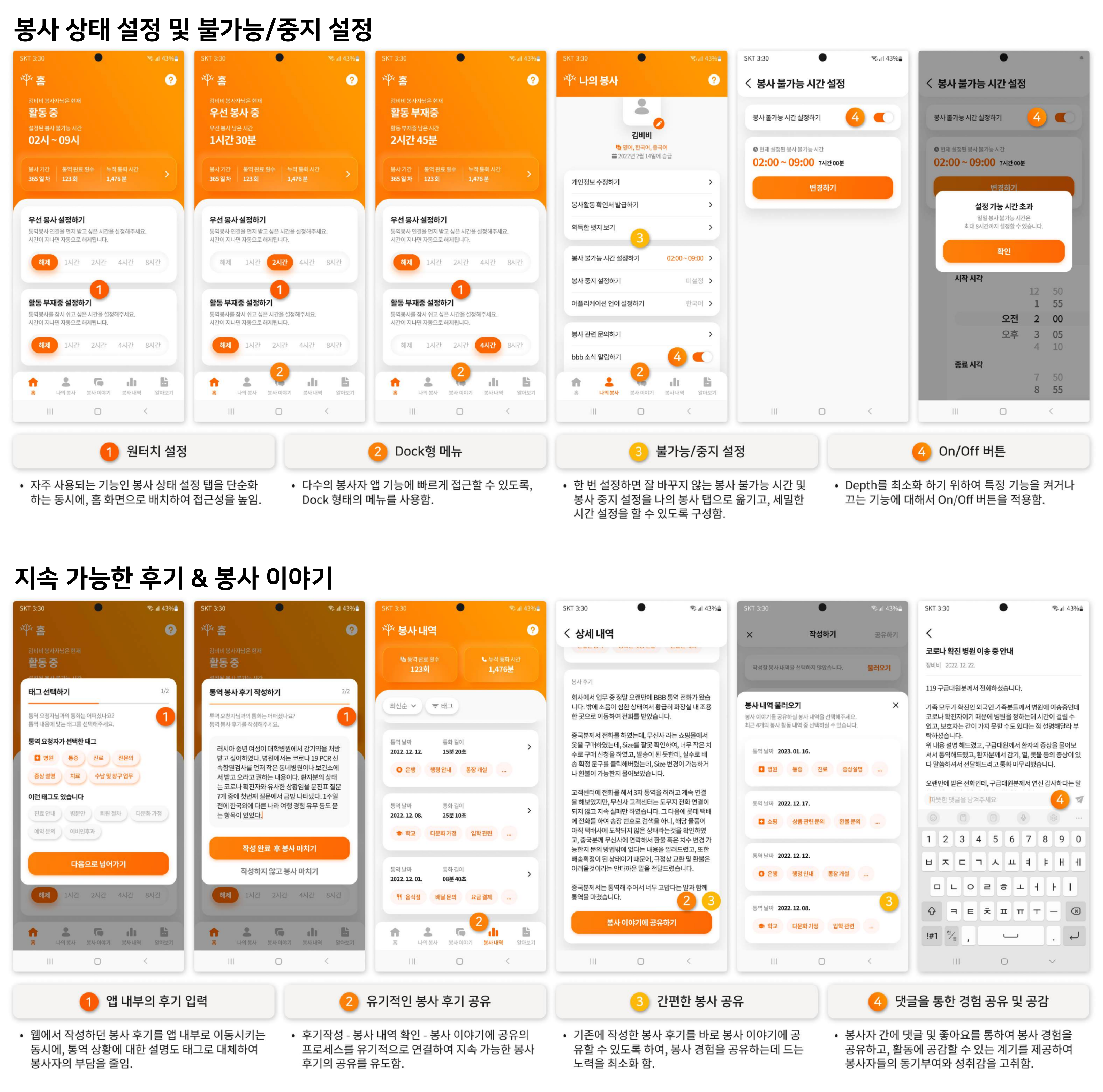 Screens for availability settings, unavailable/pause configuration, in-app review writing, and volunteer story sharing.
Shared UX Elements
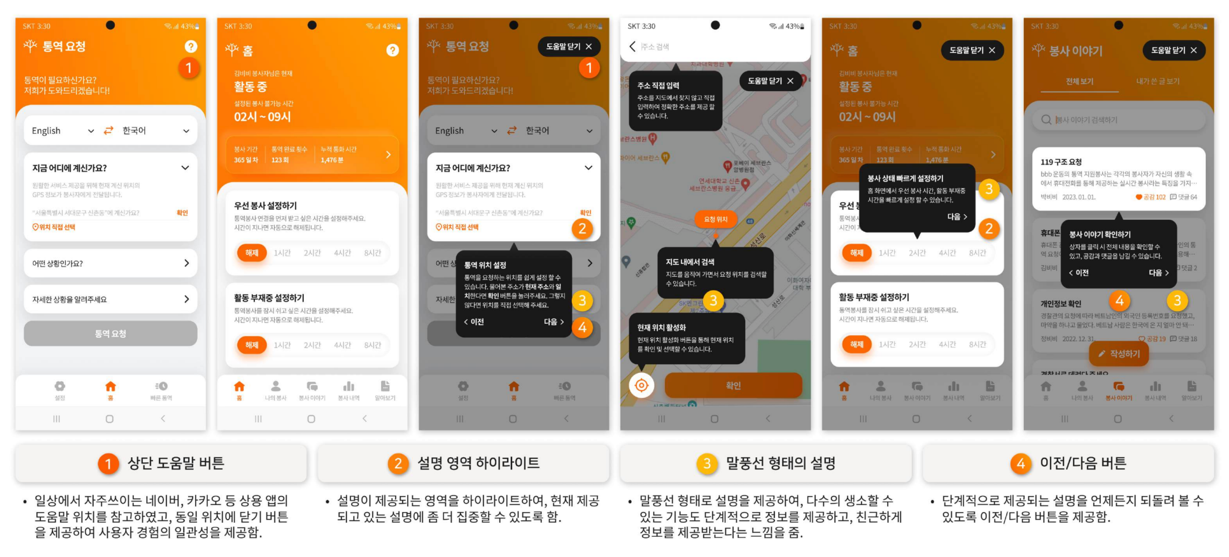
Recognizing that both existing and new users might feel some friction adapting to the redesigned and expanded feature set, a contextual help system was designed into each page. A help button at the top of each screen provides step-by-step guidance, with relevant areas highlighted and balloon-style tool-tips appearing where needed, so users can find the information they need without leaving the current screen.
5 Reflection
- This project offered an opportunity to improve the UI/UX of a service that doesn’t fit neatly into a common category. Designing the structure and interactions around the specific characteristics of a volunteer interpretation service was a meaningful challenge, and benchmarking against services with similar properties proved to be a valuable approach. The experience made it clear how much the quality of a service is shaped by seemingly foundational decisions: reducing excessive depth, centralizing features around the home screen, and making terminology and interactions consistent throughout.
- Taking ownership of the iOS volunteer app design gave me hands-on experience applying Apple’s Human Interface Guidelines to real screens. Comparing iOS and Android side by side, I came to understand that the differences, including back navigation behavior, tab bar placement, and button label capitalization, are not merely stylistic. They reflect how users have been trained to expect an app to behave, and designing against those expectations creates unnecessary cognitive friction.